News & Notes

What a Character! exhibit extended through December 2018

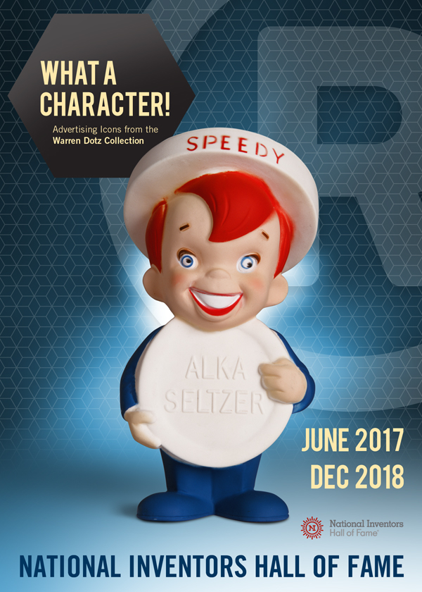
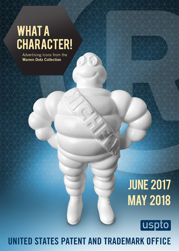
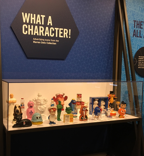
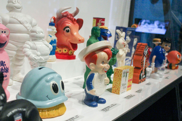
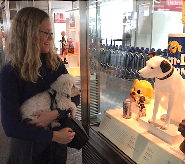
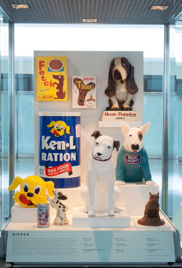
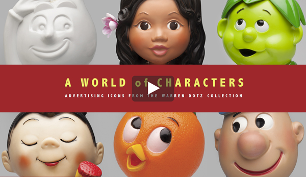
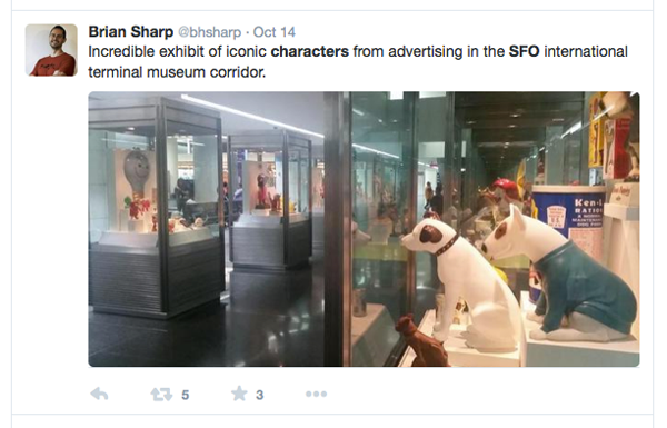
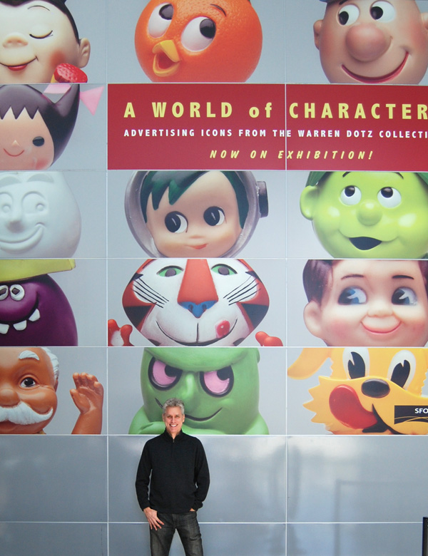
What a Character! Advertising Icons from the Warren Dotz Collection continues to be one of the most popular exhibits at the National Inventors Hall of Fame at the USPTO. The exhibit has been extended through the end of 2018. We have even bigger things in store for 2019!

National Inventors Hall of Fame Museum
600 Dulany Street, Alexandria, VA 22314

HOURS:
Monday through Friday: 10am to 5pm
Saturday: 11am to 3pm
Sundays and Federal Holidays: CLOSED
Phone: 571.272.0095

USPTO_postcard_speedy

IMG_9497 USPTO copy

Mr. Product The Graphic Art of Advertising’s Magnificent Mascots 1960-1985

Have you seen the best-selling sequel to Meet Mr. Product?

Iconic, Inspired

amazon rankingF

Lady Liberty wishes you a banging Fourth of July!

liberty_hires

What a Character! exhibit opens at USPTO

What a Character!
Advertising Icons from the Warren Dotz Collection
United States Patent and Trademark Office • June 1, 2017 to May 31. 2018 •

What a Character! opened this June 2017 at the National Inventors Hall of Fame Museum in the USPTO complex in Alexandria, Virginia. It’s so nice to see these awesome ad figures, product packaging and commercial artworks featured in our Country’s epicenter for trademark registration.

USPTO_postcard_michelin_rev

Li’l Red wishes you a Fiery Fourth of July!

lil-red

What a Character! exhibit at the USPTO

The Nationals Inventors Hall of Fame and Museum is located in the United States Patent and Trademark Office (USPTO) complex in Alexandria, Virginia. The USPTO is the modern repository and archive of America’s registration trademarks for product and intellectual property.

NIHF_logo

USPTO_logo

The exhibit design team has revamped  a wing of the museum dedicated to Intellectual Property Power. As part of that renovation I was invited to curate a newly constructed vitrine featuring iconic advertising spokes-characters.

I am pleased to announce the opening of What a Character! Advertising Icons from the Warren Dotz Collection, a mini exhibition of notable trademark characters and brand mascot figures and artwork.

The exhibit is free to the public and will be on display for one year (June 2017 to May 2018.) Many thanks to Sarah Humm and Amanda Tomasik from  Invent.org who collaborated with me on this project.

uspto_exhibit

close-up

A Visit to Sonoma California’s Tiddle E. Winks

logo

When visiting Sonoma, California be sure to drop by Tiddle E. Winks Vintage 5 and Dime right off the main square. Heidi Geffen has been a fan of our advertising books and we are honored that copies for sale have found a home in her masterfully curated gift shop.

TiddleE-Winks1

TiddleEWinks2

Meet Mr. Product in Japan

japanese_books

We are pleased to present the Japanese editions of Mr. Product, Volume 1 and Mr. Product, Volume 2 with all new dust covers and cover art.

frankfurt_book_fair_logo

Graphic-Sha Publishing (Tokyo) who also published the Japanese edition of Ad Boy, noted our new books at the Frankfurt Book Fair in 2015 and secured their rights for the Japanese market.

amazon_page

The English language editions of Meet Mr. Product and Mr. Product have spent many months atop Amazon Japan’s branding and logo design best seller list.

Gizmo Meets Nipper

One of our most well mannered and attentive visitors to the A World of Characters exhibition at SFO was Gizmo a rescue poodle. Accompanied by his best friend Annelise, Gizmo seemed particularly intrigued with Nipper, the RCA dog famously known for recognizing “His Master’s Voice.” Obviously his favorite vitrine was the one filled with advertising doggies and vintage pet food packaging.

SFO-dog-show

Canines

Logo Design Love ❤ Mr. Product

LogoDesignLove

David Airey introduces Mr. Product to his many fans and touches on Madison Avenue’s penchant for “retro-branding.”

David has been successfully self-employed as a graphic designer since 2005. Specializing in the design of brand identities, he works with clients of all sizes from his studio in Northern Ireland. He is the author and editor of three of the most popular design blogs on the Internet: davidairey.com, logodesignlove.com, and identitydesigned.com. David is also the author of LogoDesignLove, the bestselling book about logo and branding design.

get-the-book

How Many Martin Oil Company Logos and NINA’s Can You Find?

second_layout

Growing up in NYC the Sunday Entertainment section of the New York Times would have a weekly illustration by Al Hirschfeld. Hirschfeld is known for hiding his daughter’s name Nina in most of the caricatures he produced after her birth. The name would appear in a sleeve, in a hairdo, or somewhere in the background. Hirschfeld engaged in this “harmless insanity,” as he called it, of hiding her name NINA at least once in each of his drawings. The number of NINA’s concealed is shown by a numeral to the right of his signature. There are three in the Man of La Mancha.

Many brand mascots have their product’s name emblazoned across their chest. However, some are anthropomorphized where the product becomes the torso of the character. The Martin Oil Company’s serviceman is unique in that he is composed of his company’s logo several times over. It’s in the shape of his serviceman’s cap. How many can you find?

A Mid-Summer Treat

pushup

Found this summer at a flea market outside of San Francisco. Cool images of other not-so-famous but happy-faced brand mascots can be seen in Mr. Product: The Graphic Art of Advertising’s Magnificent Mascots 1960-1985.

The Atlantic meets Mr. Product

atlantic_article

Steven Heller is a contributing writer for The Atlantic, the co-chair of the MFA Design program at the School of Visual Arts, and the co-founder of its MFA Design Criticism program.

Steven and Warren discuss Meet Mr. Product and consumers’ love for advertising characters. Read more here.

Mr. Frank wishes you a Happy 4th of July!

mr.frank

Mr. Frank, anthropomorphic smiling sausages and other wiener dogs can be found in Mr. Product: The Graphic Art of Advertising’s Magnificent Mascots 1960-1985.

Warren Dotz and Mr. Product in Print magazine

print

Michael Dooley is the creative director of Michael Dooley Design and teaches Design History at Art Center College of Design and Loyola Marymount University in Los Angeles. He is also a Print contributing editor and writes on art and design for a variety of publications.

Michael and Warren talk about Mr. Product, vintage fireworks labels, and other formerly unheralded American product packaging. Read more here.

New Books! Meet Mr. Product and Mr. Product have arrived!

meet_mr.product_FBmmp_technologymmp_auto mr.product_FB  mp.foodmp.restaurants

Fresh off the Insight Editions printing presses, we are pleased to announce the 2015 hard cover edition of our bestselling Meet Mr. Product and the all new Mr. Product:  The Graphic Art of Advertising’s Magnificent Mascots 1960-1985.

Mr. Product takes up where Meet Mr. Product left off, illustrating the story of the advertising character in America in the 1960s,’70s, and ’80s.

Welcome back, Mr. Product!

Who is the REAL Mr. Product? Find out in April…

teaser

Watch the Video!

video_image

Presenting acclaimed videographer Jan Stürmann’s mini documentary about the SFO Museum’s exhibition A World of Characters: Advertising Icons from the Warren Dotz Collection.

It turns out that The Michelin Man, Reddy Kilowatt and Twinkie the Kid weren’t the only shining lights of our show. See and hear our other “stars”…as the curators, designers and gallery goers weigh in on those magnificent mascots.

Boing Boinged!

new-boingboing-logo

crealab

Keep an eye on tweets and bandwidth—if Mark Frauenfelder or any other editor of the must-read “Directory of Wonderful Things” site Boing Boing notices you, your traffic may just bounce into the stratosphere. As A World of Characters comes to a close we also wish to thank the many pop culture and business websites that featured it, including Fast Company, Laughing Squid, Kinder Modern and Blazenfluff. Also, many thanks to our friends from France at Crealab Itecom Nice for their very nice review of these great mascottes publicitaires.

My Favorite Robot

sidal
One of my favorite cases at the SFO exhibition is the “Robots” featuring the Mido Watch Robot among many other mechanical men. Companies that made nuts and bolts, timepieces, appliances and computers gravitated toward the robot as a a symbol of accuracy, strength and reliability. Of these advertising inventions perhaps my favorite is the little known Sidal Robot.

Sidal, a German manufacturer of aluminum, made aluminum rods, disks and sheets. Their robot showed off their ability to mold, assemble and transform aluminum into things of beauty. Although most of the reviewers of the exhibition concentrated on the ad icon classics like Tony the Tiger, it’s the little known ad characters that are some of the most fun. Oh, I almost forgot to mention that the Sidal robot has three arms!


robots_sized

Terrific Tweets!

While walking past the landmark City Lights bookstore in San Francisco, I was delighted to find my Firecrackers book in their window display one Fourth of July in 2000. And on my first afternoon in London a year later, there it was again at the Dover Book Shop near Charing Cross Road. Experiences like that are always gratifying to an author.

But in this day of social media, I don’t think I was prepared for the immediate and immense feedback generated by the exhibition of my advertising icon collection. Besides seeing all the smiling faces enjoying the exhibition of A World Of Characters at the SFO International Terminal, here are some of my favorite tweets:Amazing-Twitter Brilliant-Twitter Glorious-Twitter Incredible-2-Twitter

Advertising Icons from the Warren Dotz Collection

SFWhereF

A World of Characters is at the halfway mark and continues to be one of the SFO’s most popular exhibitions ever. In August the the exhibition was featured on the front page and Datebook section of the San Francisco Chronicle. In September it was a “museum pick” of the SF/ARTS magazine. This October it’s highlighted in the cover story—“Urban Art Scene”—of the San Francisco edition of Where magazine.

SFChronicleF

http://www.sfgate.com/art/article/A-World-of-Characters-TV-ad-icons-show-at-SFO-5667898.php

Have a Happy Day!

warren_wallRF

It’s very cool that the San Francisco International Airport is committed to being the world’s only fully accredited museum in an airport. My curator, Tim O’Brien tells me that the airport administration could have easily leased this 50 foot high wall-space to an airline or advertiser. Instead they gave it to my exhibition, A World of Characters. Tim and his awesome design team came up with this “Wall of Smiley Faces.” The SFO administrators thought it was wonderful and from what I’ve heard so too have the terminal’s employees!

Happy Fourth of July!

king kong

My father was a NY fireman and I grew up up in the City’s housing projects and loved living there. Kids in private homes didn’t have the park space, trees and basketball courts we did. July 4th was a big day. My friends would blow up packs of firecrackers. I admired the pack labels. So here’s a New York centric label for you to enjoy. This Chinese winged King Kong could just fly Ann Darrow up to the Empire State Building’s spire.

Collectors Weekly interviewed me this week for the occasion:

http://www.collectorsweekly.com/articles/kaboom-10-facts-about-firecrackers-that-will-blow-you-away/

Check out my New York Times featured books on the subject of Firecrackers here:

http://warrendotz.com/books/firecrackers-art-and-history/

http://warrendotz.com/books/firecrackers/

“A World of Characters” opens at SFO

exhibitF

A World of Characters:
Advertising Icons from the Warren Dotz Collection
SFO International Terminal • June 28, 2014 to January 4, 2015

A World of Characters opens today. Many thanks to my terrific curators, Tim O’Brien and Kelvin Godshall and the talented staff at the SFO Museum. It’s so nice to see these awesome ad figures, product packaging and commercial artworks featured in the world’s finest museum for pop culture artifacts.

http://www.flysfo.com/museum/exhibitions/world-characters

Woofs and Meows!

logo_collage

Cat Food for Thought and Dog Food for Thought have received many lovely reviews. Here are some of our 5 star favorites:

My favorite interview was with Tamar Arslanian and featured on her fun blog, I Have Cat. Also interviewed was my friend and muse, Christina K.:

http://ihavecat.com/2014/04/23/cat-food-for-thought-review-interview-giveaway/

Editor Ben Marks of Collectors Weekly explored the collecting and graphic design aspects of pet food label art with me:

http://www.collectorsweekly.com/articles/cartoon-kittens-and-big-eyed-puppies/

Introducing Carla Sinclair’s new terrific website, Wink––remarkable books on paper. We were so pleased to be honored.

http://winkbooks.net/post/83717495132/cat-food-dog-food-for-thought-pet-food-labels-as

Mark Frauenfelder’s The Happy Mutant Handbook was an inspiration to my publishing aspirations. As distinguished editor of Boing Boing here’s what he had to say:

http://boingboing.net/2014/05/01/cartoon-kittens-and-big-eyed.html

Also read my interview in Bark:

http://thebark.com/content/food-thought-vintage-dog-food-labels

See our book as a “Staff Pick” in the MOMA Design Store.

staff_pick

My New Books

dog&catbook

Picking the best and boldest dog and cat food labels for my two new books was easy. I have the world’s largest collection.The hard part was finding the perfect quote and “words of wisdom” to go along with each wonderful work of label art. I was also lucky to have a fantastic publisher, Insight Editions, that appreciated our vision that dog and cat books can be literate and artistic as well as fun or even funny. Award winning artist, Masud Husain did the graphic design.

Dog Food for Thought and its companion book, Cat Food for Thought will be in gift shops and book stores April 15th.

Dryad

dryad_soap+nymph

I am working on another book about advertising (debuting Spring 2015) and in the process came across this wonderful bar of soap. At first I just assumed the “Dry” in Dryad had something to do with an antiperspirant. It does. Dryad was the brand name of a modestly popular deodorant in the 1950’s. I assume the company expanded their product line in the late 1960’s to include soap bars. This of course was the dawn of the Flower Power generation with its interest in health and nature and you can see that influence in the label graphics.

What I didn’t know was that the graphic artist responsible for the label design was also referencing Greek mythology. Dryads are female spirits of nature also known as “wood nymphs.” They preside over groves and forests, more specifically a single tree which the Dryad watches—either living in the tree as part of it, or close to it. Their lives are so connected with that of the tree—that should the tree perish the Dryad dies with it. If caused by a mortal, the gods will punish him for that deed. The Dryads themselves also will punish any thoughtless mortal who would somehow injure the tree. If you want to see Hollywood’s version of Dryads, they are featured in The Chronicles of Narnia.

So there you have it. The DRYness of an antiperspirant + The AD in advertisement + The DRYAD of Greek mythology.

Sour Grapes

sour_grapes

Another silly vintage gumball vending machine card.

I’ve never really understood the attraction of sour candy, especially a sour candy for kids. At work, I sometimes give a lollipop to really well-behaved little ones and the Charms Sour Apple Blow Pops are as popular as the sweet Tootsie Pops. The graphic artist here went to the trouble of putting a sour pucker face on every grape, although to me some of the grapes look a bit depressed. Ever wonder why humans respond to sour taste with a pucker face? There’s all types of theories on the internet.

Groovy Gumball Cards

dec_layout4

If there ever was a quintessential “impulse buy” for kids, the storefront candy gumball vending machine was it. During their heyday in the 60’s and 70’s you could find a red metal and glass machine filled with candy, fake tattoos and plastic eyeballs in front of any variety or candy store. To be “with it” and “happening” with precocious preteens the vending advertising cards were quick to incorporate the “flower power” and trippy psychedelic imagery of the times.

Right on!

The Perfect Hawaiian Lei: Part 1 (The Search)

before    leis

My search for the perfect lei began the day I purchased a beautiful store display of the United Airlines Hawaiian Menehune Girl. My curator at the SFO Museum and I agreed that she would be one of the stars in the display case dedicated to “Airline and Travel Characters” in my upcoming exhibition at the airport’s International Terminal. Travel agency displays, as you can imagine, (before the days of Travelocity and Priceline) were placed in sun-drenched storefront windows. Remarkably, this figure was in great shape except for one detail––it was missing a vintage Hawaiian lei around its neck. So I needed to add an era-appropriate plastic lei. Who knew that lei technology had advanced so much since 1975? To begin, I sought out my present day “experts”: my staff, Amazon, a very cool couple I know, and Ebay.

Michaels: On the recommendation of my employees, this arts and crafts big-box chain store was the first place I looked. Apparently they have been to many Hawaiian-themed lei-making parties for their kids. But Michaels, although helpful, was a disappointment. Apparently leis are “seasonal” items and September meant a store brimming with Halloween stuff. Menehune [pronounced meh-neh-HOO-neh] are said to be a people, diminutive in size, who live in the deep forests and hidden valleys of the Hawaiian Islands far from the eyes of normal humans. I admit a nice necklace of white skeletons would have looked cool, but I needed the real thing. The Menehune’s favorite food is Mai’a (bananas) and fish. Cannibals they were not.

Amazon: Of course leis should be made of real flowers, but fake leis have progressed from thick plastic to inexpensive millimeter-thin frilly plastic, to currently in-vogue lifelike silk flowers. Amazon specialized in the latter two. So for $22 you can get a 50 “Mega Silk Lei Assortment of Tropical Hawaiian Luau Party Favors.” Not for me, but for your next Tiki party, knock yourself out.

Caroline’s Closet: Lately, whether it be lei or cat culture questions, my “go-to” couple is Christine and Greg. They are knowledgeable about all things Hawaiian. They perform in a band featuring ukeleles and are connoisseurs of Island cuisine and culture. Christine’s great suggestion was a South Dakota website, Caroline’s Closet, that “specializes in the production and making of accessories for the 18 inch dolls.” Lo and behold, Caroline’s did sell a beautiful purple and white silk lei. A contender.

Ebay: United Airlines apparently didn’t stop at Menehune store displays to promote their Hawaiian Island routes. There on Ebay was a Jim Beam Bourbon Whiskey Menehune Man decanter, given away as a gift at the airline’s sponsored 1975 Hawaiian Open golf tournament. BUT––around its neck was a miniature vintage pink plastic lei! One week later and $40 lighter it was mine. It was the winner.

Mahalo nui loa, Ebay! (Thank you very much, Ebay).

The Perfect Hawaiian Lei: Part 2 (The Menehunenecktomy)

after2

A lei is a necklace of fresh flowers, leaves, shells or feathers given as a symbol of affection. Miss Menehune has two staples embedded into each side of her thick composition plastic neck that affix in place a tight loop of thread. They look Frankensteinian but hard to see. That’s where the ends of the lei needed to go. Luckily, I had a 5-0 Nylon suture, a needle holder, scissors and jewelers’ forceps from my other line of work. Ten minutes later and a few properly placed suture knots she was good as new. I enjoyed the challenge and process in restoring this store display.

Animal Crackers

animal_crackers

Although I haven’t eaten one in a while, as a kid Animal Crackers, were my second favorite cookie after Vanilla Wafers––but then again, you can’t really bite the heads off Nilla Wafers.

Although considered a quintessential American cookie, animal crackers were an English invention and of course were called biscuits, not crackers. There were several bakeries producing the cookies at the turn of the 20th century in America, and the National Biscuit Company (now Nabisco) was one of them. To distance themselves from the other bakeries, NBC decided to evoke the “circus theme” of the Barnum and Bailey Circus—The Greatest Show on Earth—and their confections became the classic Barnum’s Animals we know today. First sold in bulk in stores from the proverbial cracker barrel, the cookies soon found their way into large tins and finally into the little cardboard boxes we all love. When the diminutive box was designed to hang from a tree as a Christmas ornament a string was added and never left the package design. Manufacturing innovations such as rotary dyes allowed the the bakeries to engrave the animal details more intricately; a great technologic advance if you are an Animal Cracker ear or foot nibbler.

Some of my favorite Animal Cracker boxes (and Animal Cracker miniature buses) can be seen above. Some are even more entertaining than the Nabisco classic. Later this year, I will write about canine crackers—aka, dog biscuits and dog bones—and how they were derived from the dry, vitamin-fortified, “sea biscuits” that sailors would take on long ocean journeys. But that’s another story and another collection.

Below is a 1974 Topp’s Wacky Pack trading card called “Creature Crackers—the snack that attacks.” One would think that with today’s fascination with zombies, dinosaurs and Twilight-like vampires this “imaginary brand” and spoof of a confection would be a best seller. I’m sure somewhere—and in some form—it already exists.

creature_crackers

The Atomic Whirl

the_atom


A neutron walks into a bar and asks the bartender, “How much for a beer?”

The bartender says, “For you, no charge.”


Perhaps it’s the graphic designer and scientist in me, I’ve always loved the look and design of the “atomic symbol.” Atomic energy has always had its dark side. In light of the Fukushima travesty, that is even more evident. But to me the atomic symbol always stood for modernity and the promise of a better future. The symbol was based on the model of the atom as devised by Ernest Rutherford (the so-called Rutherford Atom) whereby electrons spin around a nucleus––although you usually don’t get to see the protons and neutrons in the central nucleus of these logos.

The atomic symbol is most often integral to United Nations, national, and international energy commission logos, but also can be found on the uniforms of the Albuquerque Isotopes minor league baseball team, the opening and closing credits of TV’s Big Bang Theory and of course the Genius Bar of every Apple Store in the country. A similar symbol––with a wonderful name, the Atomic Whirl––is the symbol of the American Atheists organization although I’ve never seen one hanging from a gold chain around someone’s neck.

AtheismLogo

Just the other day I ordered a packet of matchbox labels to obtain a cute cat image. Finding an atomic themed label therein was the bonus prize. I’ve included above a few versions of the atomic symbol from my itsy-bitsy atomic collection. And you can find below some interesting research by Alex Wellerstein who is even more fascinated with this logo and its various incarnations from 1949 on.

http://blog.nuclearsecrecy.com/2013/01/11/the-story-behind-the-iaeas-atomic-logo/

http://blog.nuclearsecrecy.com/2012/04/13/friday-image-the-atomic-energy-commission-seal-1949/


In Love with Miss Lektro Set

lektro_can_revised

Good design makes me happy.

And that is why this can of 1969 Lektro Set has been sitting on my studio drafting table all summer.

If I were ever anthropomorphically transformed into, let’s say, a bottle of 1960’s Hai Karate men’s cologne, Miss Lektro Set’s pouty lips would certainly catch my eye. She looks great even under one of those big salon hair dryers that the product’s package designer craftily fashioned out of its white plastic cap.

For those interested, Lektro Set was a spray you could use to “set” hair “between shampoos” by spraying and sitting under a dryer for ten minutes.

lektro_ad

Digger and My Brother

digger_calenderR

Growing up, my brother and I could not have been more different. I had that über competitive streak and perfectionist personality and he had the easy going one. I had to be number one in every class and grade and I can’t remember ever seeing my brother crack open a text book, even once…although I’m sure he did. I remember, as kids one summer, we were partners in a treasure hunt—the camper finding the most peanuts gets the grand prize. Only he got hungry and snacked though our winnings before the final tally :(

Fast forward a few decades. It’s funny how similar brothers can become. Some might even say we now look like identical twins (he’s a few years older). What really is interesting is that I have a career in the medical field and as you can tell by this website, enjoy writing about advertising. My brother, on the other hand, is a very successful advertising executive with a special interest in medicine. He creates copy and oversees advertisements for all types of medical lasers and medications, including his team’s award-winning promotional calendar featuring Digger the Lamisil® fungus. Watch your toes! In that calendar’s month of October, Digger had a Halloween treat for your toenails, AKA: athlete’s foot.

A belated congratulations on your wedding, Rich. Wishing you and Cathy, (fungal-free) health and happiness!

Light of India: Now an e-Matchbox Book

lightofindia

Light of India not only comes in it own slip case, but there is also a striking strip on the side of the box so that if you actually want to use it to light a match, you can. The production team at Ten Speed Press did a wonderful job to make this happen. Not only is it the first book about matchbox art from the Indian Subcontinent, but it is the first book ever to double as a matchbox. Seinfeld fans might recall Kramer’s book about coffee tables doubling as a coffee table. Well, it’s kinda like that!

A year ago Random House editors chose Light of India as a selection for their digital book initiative. It was with trepidation that I gave them permission to publish Light of India as an ebook. As its creator, I was concerned that it would be missing those unique features mentioned above. But it was a review on Amazon from Megan Doherty at Galaxy Ink Tattoo that changed my mind. She wrote that “Light of India has great pictures of matchbook artwork. I am inspired by the colors.” Then a comment on the London-based Indian illustrator, Parul Arora’s, terrific blog: “Living away from India has changed so much for me. Its helped me recognise the beauty in things that I took for granted earlier. Anyway, I think this book is beautiful and very inspiring and I feel very silly saying this but I’m extremely proud of it.”

As an author, to hear that your book inspired someone else’s artwork or to read that it made someone proud of their heritage and culture, is very gratifying. So perhaps it’s more important to get your work out there. After all, print editions run their course but digital books will be ongoing in the cloud.

So I am pleased to announce Light of India’s debut as an ebook this July. BTW, here is Parul Arora’s website review of Light of India:

Fireworks Super Hero: No Cha

nocha+cap

As a kid I loved watching episodes of Superman on TV. Superpowers made him good at everything (and something to aspire to) but those abilities also made him ultimately infallible and a bit predictable. I suppose the success of Marvel comics was in great part having flawed superheroes with limited powers. For example, Thor has primarily his hammer-wielding strength and Captain America is armed only with an indestructible, boomerang-like shield.

When researching the Firecrackers book, I was surprised to see how few Asian mythologic heroes adorned the labels of firecracker packs from China. Perhaps the Chinese illustrators had mainly the American market in mind.

One character depicted on the Roger brand label did capture my attention. He is No Cha (also called Nezha). No Cha is particularly fond of fighting dragons, rides on a wheel of fire and battles his nemeses with a hand-held golden ring that can expand and shrink. No, he’s not a girl, even if he does favor a pigtail hairstyle and skirt. No Cha could fit right in with Marvel’s team of Avengers although he is hundreds of years older.

When Ten Speed Press asked me to produce a gift calendar based on the book Firecrackers: The Art & History, I was only too happy to put No Cha on the cover. I was not surprised to learn that No Cha’s star potential transcends print, starring in a 1979 Chinese animation film titled Nezha Conquers the Dragon King. You can see a snippet of it here, but I like the firecracker No Cha better:

Doggie Bags

doggie_bags

I once went to an Aviation Collectibles Show and sure enough there are people who collect air sickness bags.

Not me. I collect Doggie Bags.

A year ago I won an auction posted by a like-minded pop culture accumulator—20 doggie bags in all and my new collection was born. I have been adding to it since. I like the cute and naive imagery. In particular they remind me, as a kid, of a rare family outing to the famous Senior’s Restaurant of Sheepshead Bay. The highlight for me was bringing home to my dog, Corky “her half” of Brooklyn’s finest roast beef au jus dinner in a soggy, gravy-soaked, doggie bag. To Corky, “ALPO meat-by-products,” it was not. I don’t think she even chewed it. Just flipped it up in the air, chomped and then it was gone. Two gulps followed by a stare that said, “Where did it go? Any more?” My sad, sweet Corky.

When American restaurant serving proportions got so immense, it was no longer necessary to blame the dog for our take out desires. And a meal that was once all mashed into a grease-resistant paper sack was eventually doled out into partitioned styrofoam containers and more recently individual biodegradable cartons.

As a collector and admirer of common items like matchbooks, firecracker and candy wrappers, and food labels with advertising characters, I’ve found the doggie bag imagery to be equally as charming. But unlike those items and much like sugar packets, no patron actually bought this particular product. It was free for the asking. The bags didn’t have to compete with other advertising labels and graphics on a store shelf, so their printing is quite simple and inexpensive, most often only one or two colors. Happy, hungry, tongue-sticking-out doggies and “alluring” French black poodles (see illustration above for what I mean) begging for a bone were the norm.

There have been some writers interested in the history of doggie bags. The history actually mirrors the changes in American restaurant food service, our dining habits and cultural eating-out-etiquette. Here is a link to one of those articles by the the writer Joseph Gambardello of the Philadelphia Inquirer:

http://articles.philly.com/2013-03-15/news/37717167_1_doggy-bag-bagcraft-leftovers

Musings on Mermaids

mermaids

In 2000, as Firecrackers was being printed in Hong Kong, my publicist at Ten Speed Press inquired if there were any national magazines that might be interested in featuring the book. I suggested Playboy, among others.

Although written for adults, Firecrackers would eventually be cited on several statewide librarian “Young Adult Reading Lists” as its mix of comic book style art, world history and pyrotechnics proved very appealing to many middle school boys. Not surprisingly, Playboy did review the book. Their readership was the same feisty group of boys, just bigger and older!

When queried by the publicist as to what image she might offer Playboy, it was a no- brainer: the Mermaid Brand firecracker label. The Mermaid was a bit of an anomaly as mermaids aren’t really found much in Asian folklore. As with the Cowboy and Pirate brands, this South China Sea Mermaid was designed to appeal to American market tastes. (You can see the label in the Books section of the website: Firecrackers!).

Here are two other mermaids. One, the face page of a city street map, recently found, and the other discovered at a flea market a few years back. Both were designed to promote tourism. Why travel related? The Mermaid is the coat-of-arms symbol of Poland’s capital, Warsaw. Mermaids have traditionally also been used to promote luxury sea liners, and even to this day The Little Mermaid is a prominent selling point of Disney Cruise Lines.

How did an instant mashed potatoes mix inspire outsider art?

smash_martian

Health advocates marvel how often Americans take the most nutritious part of the potato—the skin—peel it off and discard it and then either fry the rest in oil or boil out all the vitamins before mashing with a 1/4 stick of butter.

The Brit advertising characters, the Smash Martian robots, conversely took things one step further. They would mock humans for even attempting to mash their potatoes from scratch when they could easily partake in the time-saving, out-of-this-world, technological advancement of Cadbury’s Smash instant mash. The catchphrase “For Mash Get Smash” is an iconic advertising slogan in the UK.

Around the TV ad campaign’s height of popularity in the mid 1970’s, workers from the Halewood Body and Assembly plant near Liverpool, England, began making their own miniature Martians entirely from components of the Ford Escort cars that were being manufactured at the plant. Press clippings from March 1976 indicate that while bosses at the plant didn’t condone the pilfering of parts, they grudgingly admired the ingenuity of their production line staff.

I’ve just added a second Halewood Smash Martian to my robot collection, and as you can see the two are very different. What I love most about these outsider pop-artworks is their cool metallic colors. Once assembled, the factory workers would send their little robot-man through the paint conveyor for a professional Ford Escort powder coating. In the case of these robots, velvet purple and metallic blue.

(In researching this “Note,” I came across a story that a blue 1975 Ford Escort once owned by Pope John Paul II sold for $690,000. The cost of my little blue martian…not so much…but not cheap, as the bidding was surprising fierce from Smash collectors across the pond.)

The Mad Scientist

fizzies

Market investors have read a great deal recently about a low-price growth stock, SodaStream. Even the New Yorker magazine detailed this make-your-own-soda machine company’s efforts to run a commercial in this year’s Superbowl. Their stylish, modern kitchen appliance can be found in Bed, Bath and Beyond, and Samsung is even designing refrigerators incorporated with them.

Of course every American schoolboy once knew that if you wanted to make a home-brewed carbonated drink, it required no more than to drop a Fizzies tablet in a glass of water. Fizzies, first developed in the 1950’s, was eventually acquired by the pharmaceutical giant, Warner Lambert, which by 1971 was producing seven flavors. In that year, colorful package illustrations depicted a Wizard, Witch, Zulu Warrior, Genie and Magician among others.

This is my newest find and my favorite Fizzies character: The Mad Scientist. It is exactly who you were, when topping off a bubbly “imitation cherry” Fizzies drink with a splat of Reddi-wip.

(The original Fizzies ad character, a smiling tablet, appeared in Meet Mr. Product and two Fizzies packets are on view in Ad Boy)

A Collector of Cat Food Tins

labels_cat

Labels, a short story by Louis de Bernières is about a man who finds himself drawn towards collecting cat food labels and then finds it escalating into an obsession. He cannot draw himself away from these labels regardless of the effect it has on his job, wallet, marriage and other relationships in his life. But in the end his collection becomes his salvation, as one man’s hoard of pet food might be another gourmand’s pâté. It is a quirky story, beautifully told—part O’Henry and part Twilight Zone.

Labels also comes bound as two beautifully illustrated diminutive editions— the first, a limited edition of books signed by the author in 1993 and the second published in 2001.

A Sneak Preview of the Next Gift Book

Fetch

It’s been two years in the making. My co-author, Masud Husain, has finished the cover and interior design. Now we begin the process to perfect things graphically and get it to the publisher.

There’s a theme I’ve always wanted to explore. We’ve selected really fun and exciting artwork. Discovering and acquiring the world’s largest collection has helped. That’s all I can say for now about this “pet project.”

An Interview About Collecting Ephemera

Collecting Ephemera

Here’s an interview from 2009 about how the Firecracker books came together. http://ephemera.typepad.com/ephemera/2009/03/firecrackers-author-warren-dotz-interview.html